Checkout Redesign — From Overload to a Simpler Flow. Drop-off fell from 67% to 46%.إعادة تصميم شاشة الدفع من التشتت إلى المسار الأبسط. فانخفض التسرّب من 67٪ إلى 46٪.
ImpactالأثرDrop-off 67% → 46%التسرّب 67٪ ← 46٪
01 — The Problem01 — المشكلة
I was asked to add one feature. I found a bigger problem.طُلب مني إضافة ميزة واحدة. فاكتشفت مشكلة أكبر.
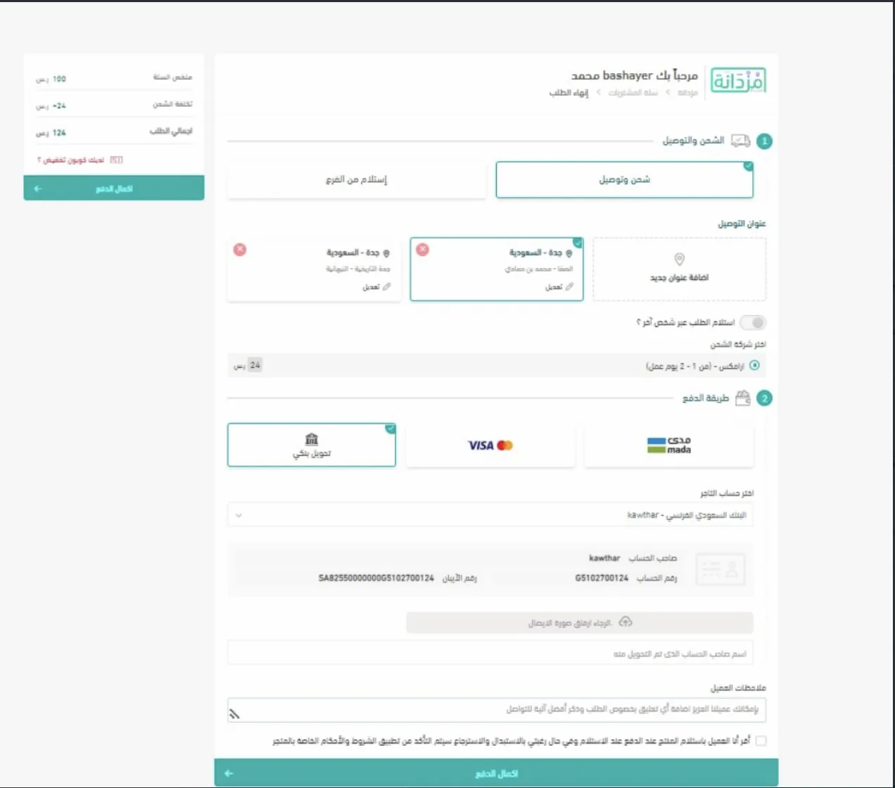
The assignment was narrow: add a "save card" option to the existing checkout. Opening that screen made the real issue obvious. It was one long page with every section expanded at once: delivery type, saved addresses, shipping carrier, payment method, bank-transfer details, receipt upload, notes, and terms, all competing for attention. Worst of all, the primary "Complete Payment" button appeared twice, once in the summary and once at the bottom, leaving buyers unsure which one was real.كانت المهمة محدودة: إضافة خيار «حفظ البطاقة» إلى شاشة الدفع الحالية. لكن بمجرد أن فتحتُ الشاشة اتّضحت مشكلة أكبر. كانت صفحة واحدة طويلة بكل أقسامها مفتوحة في آنٍ واحد: نوع التوصيل، والعناوين المحفوظة، وشركة الشحن، وطريقة الدفع، وكلها تتنافس على انتباه المستخدم. والأسوأ أن زرّ «إكمال الدفع» الأساسي كان يظهر مرّتين، مرّة في الملخّص وأخرى في الأسفل، فيحتار المشتري أيّهما الصحيح.
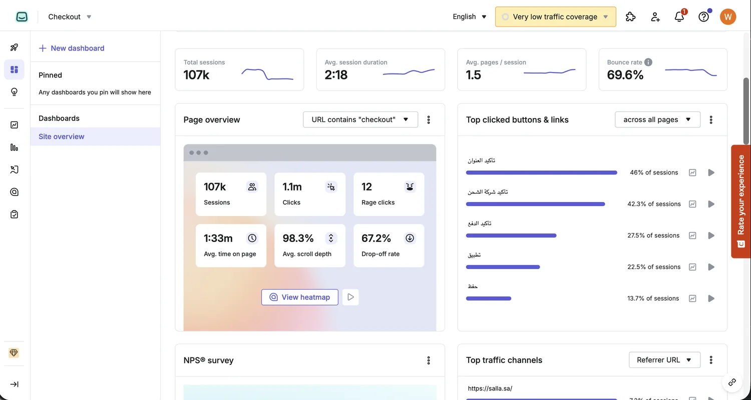
That overload was costing us conversions: drop-off sat at 67% and bounce at 70%. Rather than ship the small feature and move on, I took the bigger problem to leadership, sketched a few simple directions, and asked for the room to fix it. The Head of Product and the CEO backed it immediately. The save-card feature was shelved. Reducing cognitive overload and recovering lost completions came first.هذا الحِمل الذهني كان يكلّفنا تحويلات فعلية، إذ بلغ التسرّب 67٪ والارتداد 70٪. لذلك رفعتُ المشكلة إلى الإدارة، ورسمتُ بعض الاتجاهات البسيطة، وطلبتُ المساحة لمعالجتها. ودعم رئيس قسم المنتج والرئيس التنفيذي الفكرة فوراً، فأُرجئت ميزة حفظ البطاقة لأن تخفيف الحِمل الذهني واسترداد الطلبات المتروكة كانا الأولى.
02 — Research02 — الأبحاث
A structured diagnosis before a single sketch.تشخيص منهجي قبل أي رسمة.
Before sketching anything, I watched. Hotjar session recordings showed buyers hesitating at the top of the screen, scrolling past sections they weren't ready for, and abandoning without engaging a single field. Heatmaps confirmed it: interaction clustered near the top. Everything below the fold was largely ignored — yet the screen demanded it all upfront.قبل أي رسم، راقبتُ أوّلاً. أظهرت تسجيلات الجلسات في Hotjar أن المشترين يترددون عند أعلى الشاشة، يمرّون على أقسام لم يحنِ وقتها بعد، ويغادرون دون أن يتفاعلوا مع حقل واحد. وأكّدت الخرائط الحرارية ذلك: التفاعل يتمركز في أعلى الصفحة فحسب — أما ما هو أسفل الطيّة فيُتجاهَل في معظمه، رغم أن الشاشة تطالب بكله دفعة واحدة.
I challenged every element with the same question: does the buyer actually need this right now? Most of the time, the answer was no. Showing all saved addresses as an open list sounds harmless — but what if a buyer has ten? The page becomes unmanageable before they've made a single decision. The "Complete Payment" button appearing at both top and bottom doesn't add clarity; psychologically, two identical CTAs create doubt rather than confidence — neither one feels authoritative. And the action the buyer needed to take was buried below the fold: on a completion-critical screen, they shouldn't have to scroll just to find out what to do next.تحدّيتُ كل عنصر بالسؤال ذاته: هل يحتاجه المشتري الآن فعلاً؟ في معظم الأحيان، الجواب كان لا. عرض جميع العناوين المحفوظة كقائمة مفتوحة يبدو بسيطاً — لكن ماذا لو كان لدى المشتري عشرة عناوين؟ الصفحة ستصبح غير قابلة للإدارة قبل أن يتخذ قراراً واحداً. وظهور «إكمال الدفع» في الأعلى والأسفل معاً لا يُضيف وضوحاً؛ نفسياً، وجود زرّين متطابقَين يُولّد شكّاً لا ثقة — لا يبدو أي منهما نهائياً. وفوق ذلك كله، الإجراء المطلوب من المشتري كان مخفياً أسفل الطيّة: في شاشة هدفها الإتمام، لا يجب أن يضطر المشتري للتمرير ليعرف ماذا عليه أن يفعل.
BEFOREقبلDuplicate CTA ①زرّ دفع مكرّر ①Every section open at onceكل الأقسام مفتوحة دفعة واحدةDuplicate CTA ② — which is right?زرّ مكرّر ② — أيّهما الصح؟
Eight open sections. Two identical CTAs. Primary action hidden below the fold — a buyer couldn't see what to do next without scrolling first.ثمانية أقسام مفتوحة. وزرّان متطابقان. والإجراء الأساسي مخفي أسفل الطيّة — المشتري لا يرى ما عليه فعله بعد قبل أن يمرّر الصفحة.
I supplemented the behavioral data with NNG's checkout usability research and a structured competitive review. One principle recurred across every source: show only what the buyer needs at their current decision stage — nothing earlier, nothing extra.أكملتُ بيانات السلوك بأبحاث قابلية استخدام شاشات الدفع من NNG ومراجعة منهجية للمنافسين. مبدأ واحد تكرّر في كل مصدر: لا تعرض إلا ما يحتاجه المشتري في مرحلة قراره الراهنة — لا شيء قبل وقته، ولا شيء زائد.
Data-backed detailتفصيل مدعوم بالبيانات
City selection defaulted to an alphabetical list. I pulled order-volume data from Salla's data team: 40% of orders shipped to Riyadh. Reordering the city list by frequency reduced the median taps to select a destination — removing invisible friction for the majority of buyers.اختيار المدينة كان يعتمد قائمة أبجدية مجردة. استخرجتُ بيانات حجم الطلبات من فريق البيانات في سلّة: 40٪ من الطلبات تشحن إلى الرياض. إعادة ترتيب القائمة حسب الحجم قلّصت متوسط الضغطات لاختيار المدينة — وأزالت احتكاكاً غير مرئي كان يمسّ الغالبية العظمى.
Research-backed additionإضافة مدعومة بالبحث
The old screen showed no product images. Research consistently links product thumbnails at checkout to higher completion rates: buyers who can see what they ordered stay in the flow instead of abandoning to double-check the cart. It reinforces ownership at the exact moment it matters most. Adding them was non-negotiable.الشاشة القديمة لا تعرض أي صور للمنتجات. الأبحاث تربط باستمرار وجود صور مصغّرة للمنتجات أثناء الدفع بارتفاع معدلات الإتمام: المشتري الذي يرى ما طلبه يبقى في المسار بدل أن يتركه ليعود ويراجع السلّة. الصورة تُعزّز شعور التملّك في اللحظة التي تعنيه أكثر. إضافتها لم تكن خياراً.
The finding wasn't that the screen had too many fields. It was that the screen was built around the system's data model, not the buyer's decision sequence. The fix couldn't be cosmetic.الخلاصة لم تكن أن الشاشة تحتوي حقولاً كثيرة. بل أنها بُنيت حول نموذج بيانات النظام، لا حول تسلسل قرارات المشتري. الإصلاح لا يحتمل أن يكون شكلياً.
03 — The Approach03 — المنهج
One principle: progressive disclosure.مبدأ واحد: الكشف التدريجي.
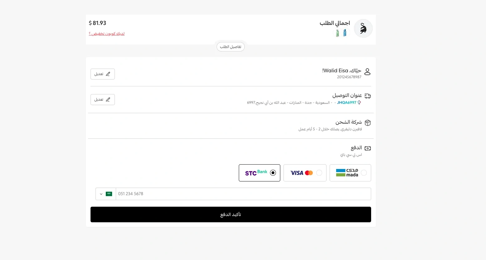
Instead of forcing every decision onto one screen, I applied progressive disclosure: each piece of information gets its own collapsible section, shown only when it is actually needed. The flow became a sequence the buyer moves through one task at a time, with a single clear call to action.بدل أن تُفرض كل القرارات على شاشة واحدة، طبّقتُ مبدأ الكشف التدريجي (Progressive Disclosure): كل معلومة في قسمٍ خاص بها قابل للطيّ، لا يظهر إلا حين تُطلب فعلاً. وصار المسار تسلسلاً ينتقل فيه المشتري مهمة واحدة في كل خطوة، مع زرّ إجراء واحد واضح.
1Delivery addressعنوان التوصيل
2Shipping companyشركة الشحن
3Paymentالدفع
Built to scaleمُصمَّم للتوسع
The collapsible structure wasn't just a UX choice — it was a scalability decision. New payment methods, shipping options, or future requirements can be added as sections without breaking the layout or overwhelming the buyer. The screen grows without becoming the problem it used to be.بنية الأقسام القابلة للطيّ لم تكن مجرد قرار تجربة مستخدم — بل كانت قراراً للتوسع. طرق دفع جديدة، خيارات شحن إضافية، أو متطلبات مستقبلية يمكن إضافتها كأقسام دون أن تكسر التخطيط أو تُثقل المشتري. الشاشة تنمو دون أن تعود إلى المشكلة التي كانت عليها.
Performance as a constraintالأداء كقيد تصميمي
Keeping sections collapsed by default wasn't only about focus — it reduced the page's initial rendering load. Fewer elements active on arrival means faster load times, which matters in a flow where a slow screen is a dropped order.إبقاء الأقسام مطويّة افتراضياً لم يكن فقط لصالح التركيز — بل كان يقلّل حمل التصيير الأوّلي للصفحة. عناصر أقل نشطة عند الوصول تعني أوقات تحميل أسرع، وهو ما يهم في مسار يعني فيه التأخير طلباً ضائعاً.
AFTERبعدOrder summary tucked awayملخّص الطلب قابل للطيّEach section collapsed, editableكل قسم مطوي وقابل للتعديلOne clear CTAزرّ واحد واضح
04 — Testing & Rollout04 — الاختبار والإطلاق
Tested before built. Watched before shipped.اختبرتُ قبل البرمجة. وراقبتُ قبل الإطلاق.
The design started as wireframes. Before any production code was written, I ran the wireframes past real users to surface what a visual review alone would miss.بدأ التصميم wireframes على الورق. قبل كتابة أي كود للإنتاج، عرضتُ الـ wireframes على مستخدمين حقيقيين للكشف عما تفوت عليه المراجعة البصرية وحدها.
One finding stood out — caught before a single line of code was written.برز اكتشاف واحد — تمّ رصده قبل كتابة سطر كود واحد.
Testing finding — wireframe stageنتيجة الاختبار — مرحلة الـ wireframe
A down-arrow next to the order total was meant to reveal the full invoice breakdown. In testing with real users, no one tapped it — they didn't read it as interactive. The fix was adding a text label: "Invoice details" next to the arrow. Once the label was there, users reached the breakdown without hesitation. One label. Caught before a single line of code was written.سهمٌ متجه للأسفل بجوار إجمالي الطلب كان مقصوداً منه إظهار تفاصيل الفاتورة. في الاختبار مع مستخدمين حقيقيين، لم ينقر عليه أحد — لم يُقرأ كعنصر تفاعلي. الحل كان إضافة نص: «تفاصيل الفاتورة» بجوار السهم. فور إضافته، وصل المستخدمون إلى التفاصيل دون تردد. نص واحد. اكتُشف قبل كتابة سطر كود واحد.
Post-development reviewمراجعة ما بعد التطوير
After development was complete, I audited the built screens against the intended design — logging every deviation and producing a prioritised fix list. No redesign ships cleanly; the review existed to close the gap before buyers ever saw it.بعد انتهاء التطوير، دقّقتُ الشاشات المبنية مقابل التصميم المقصود — وثّقتُ كل انحراف وأنتجتُ قائمة إصلاحات مرتّبة حسب الأولوية. لا يُطلق أي تصميم معاد دون فجوات؛ المراجعة وُجدت لإغلاقها قبل أن يراها أي مشتري.
Staged rolloutإطلاق تدريجي
The initial release ran on three stores. I watched the sessions, noted friction patterns, and gathered observations before the wider rollout. The 67% → 46% drop-off result reflects that early data — measured, not assumed.الإطلاق الأوّلي كان على ثلاثة متاجر. راقبتُ الجلسات، وسجّلتُ أنماط الاحتكاك، وجمعتُ الملاحظات قبل الانتقال للإطلاق الأوسع. نتيجة التسرّب من 67٪ إلى 46٪ تعكس تلك البيانات المبكّرة — مقاسة، لا مفترضة.
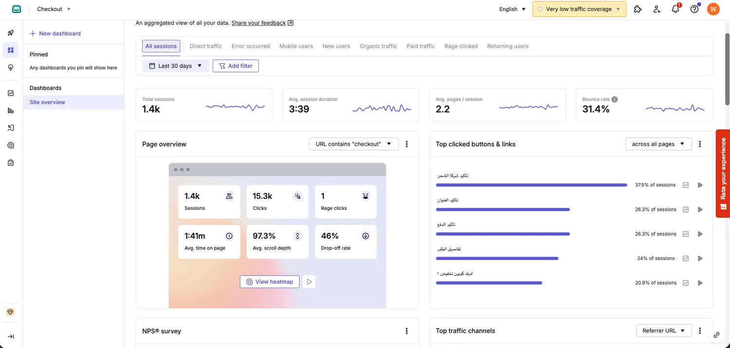
Real product analytics — before vs afterتحليلات المنتج الفعلية: قبل وبعد
The same dashboard, before and after. Compare the Drop-off rate and Bounce rate cards; "after" reflects early post-launch traffic.نفس اللوحة، قبل وبعد. قارِن بطاقتَي معدل التسرّب ومعدل الارتداد، مع الانتباه إلى أن «بعد» تعكس ترافيكاً أوّلياً بعد الإطلاق.
05 — The Solution05 — الحل
From one overwhelming page to a focused, sectioned flow.من صفحة واحدة مكتظّة إلى مسار مركّز مقسّم بوضوح.
Every section now collapses into a clean summary row with a single edit action, and the order details tuck away at the top. The buyer sees one clear path and one unmistakable button: "Confirm Payment."صار كل قسم يُطوى في سطر ملخّص نظيف مع زرّ تعديل واحد، وتفاصيل الطلب تنزوي في الأعلى. يرى المشتري مساراً واحداً واضحاً، وزرّاً وحيداً لا لبس فيه: «تأكيد الدفع».
BEFOREقبلDuplicate CTA ①زرّ دفع مكرّر ①Every section open at onceكل الأقسام مفتوحة دفعة واحدةDuplicate CTA ② — which is right?زرّ مكرّر ② — أيّهما الصح؟
AFTERبعدOrder summary tucked awayملخّص الطلب قابل للطيّEach section collapsed, editableكل قسم مطوي وقابل للتعديلOne clear CTAزرّ واحد واضح
The Resultsالنتائج
Early results from the initial rollout · 2025نتائج أوّلية من الإطلاق المبدئي · 2025
+64%+64٪
Lift in completed checkoutsارتفاع في نسبة إتمام الطلبات
Drop-off 67.2% → 46% · a 32% relative reductionمعدل التسرّب 67٫2٪ ← 46٪ · انخفاض نسبي 32٪
2 → 12 → 1
Conflicting CTAs resolved to oneزرّان متضاربان أصبحا زرّاً واحداً
1 → 31 → 3
One screen became a 3-step flowشاشة واحدة صارت مساراً من 3 خطوات
"I was asked to add a feature and ended up removing most of a screen. In checkout, almost everything that isn't the next decision is standing in front of it."«طُلب مني إضافة ميزة، فانتهيتُ بـحذف معظم الشاشة. في صفحات الدفع، كل ما ليس هو القرار التالي يقف في طريقه.»
Is a checkout losing you buyers?هل تفقدون مشترين عند الدفع؟
Heavy flows lose people one step at a time. Taking them apart is work I enjoy.المسارات الثقيلة تفقد الناس خطوة بخطوة، وتفكيكها عمل أستمتع به.