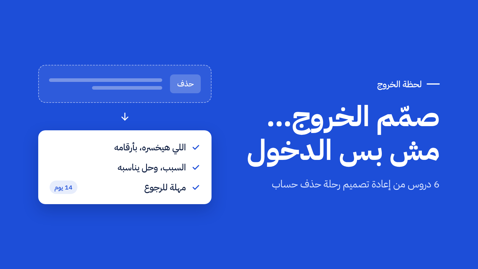
In most companies, a whole team is dedicated to acquiring new users, with daily numbers tracking every signup. But you rarely find anyone watching who leaves. The reason is simple: the angry user opens a ticket. The user who has decided to leave says nothing — they press a button and disappear. في أغلب الشركات فريق كامل مهمته جلب عملاء جدد، وأرقام يومية تتابع كل تسجيل. لكن قليلاً ما تجد أحداً يتابع من يغادر. والسبب بسيط: المستخدم الغاضب يفتح تذكرة دعم، أما المستخدم الذي قرر المغادرة فلا يقول شيئاً. يضغط زراً ويختفي.
In this article I'll walk through how to design the moment of departure itself: how to spot the problem, how to read its numbers, and how to build an exit flow that helps the user instead of trying to trick them. I'll use an example from my work on an e-commerce platform. في هذا المقال سأشرح كيف تصمم لحظة المغادرة نفسها: كيف تكتشف المشكلة، وكيف تقرأ أرقامها، وكيف تبني رحلة خروج تساعد المستخدم بدل أن تحاول خداعه. وسأستخدم مثالاً من عملي على منصة تجارة إلكترونية.
The problem list your team works from mostly comes from tickets, complaints, and big-customer requests. These are real problems — but they're not all the problems. The most dangerous ones are the ones nobody opens a ticket about. قائمة المشاكل التي يعمل عليها فريقك غالباً مصدرها التذاكر والشكاوى وطلبات العملاء الكبار. هذه مشاكل حقيقية، لكنها ليست كل المشاكل. أخطرها تلك التي لا يفتح أحد بسببها تذكرة.
So it isn't enough to research only when you're asked to. Set aside a fixed slot for reviewing behavior without a specific question: where users stop, what they leave behind, when they disappear. This kind of research isn't tied to a project — which is exactly why it finds what projects don't. لذلك لا يكفي أن تبحث حين يُطلب منك. خصص وقتاً ثابتاً لمراجعة السلوك دون سؤال محدد: أين يتوقف المستخدمون، وما الذي يتركونه، ومتى يختفون. هذا النوع من البحث لا يرتبط بمشروع، ولهذا يجد ما لا تجده المشاريع.
In the example, nobody asked for a review of the deletion numbers. The problem surfaced because tracking merchant behavior was a continuous habit, not a one-off task. في المثال، لم يطلب أحد مراجعة أرقام الحذف. ظهرت المشكلة لأن متابعة سلوك التجار كانت عادة مستمرة، لا مهمة مؤقتة.
Try this: open the cancellation or account-deletion numbers in your product. Do you know why the last 100 users left? جرّب: افتح أرقام إلغاء الاشتراك أو حذف الحسابات في منتجك. هل تعرف لماذا غادر آخر 100 مستخدم؟
Before you ask "how do we reduce churn?", ask: which churn is worth reducing? قبل أن تسأل «كيف نقلل المغادرة؟»، اسأل: أي مغادرة تستحق أن نقللها؟
Not every leaving user is a loss. Some came only to try, and were going to leave no matter what. If you count success against them, any design will look like a failure. If you try to talk them into staying, you'll annoy them for no reason — and probably push them away from coming back when they're ready to be serious. ليس كل مستخدم يغادر خسارة. بعضهم جاء ليجرّب فقط، وكان سيغادر مهما فعلت. لو حسبت النجاح عليهم، سيبدو أي تصميم فاشلاً. ولو حاولت إقناعهم بالبقاء، ستزعجهم دون فائدة، وربما تبعدهم عن العودة حين يصبحون جادين.
In the example, many of the deleted stores were created to try the platform out. So the decision was: في المثال، كثير من المتاجر المحذوفة أُنشئت للتجربة. فكان القرار:
- The success metric is calculated against active stores only.يُحسب هدف النجاح على المتاجر النشطة فقط.
- The reason "I was only trying the platform" is added — so the split is based on the user's answer, not on an assumption.يُضاف سبب «كنت أجرّب المنصة فقط»، فيصبح الفصل قائماً على إجابة المستخدم، لا على افتراض.
- Whoever picks that reason sees no retention attempt at all.من يختار هذا السبب لا يرى أي محاولة لإقناعه بالبقاء.
The rule: the right metric starts with a precise definition of who you're measuring on. القاعدة: المقياس الصحيح يبدأ بتعريف دقيق لمن تقيس عليه.
People react more strongly to what they'll lose than to what they might gain. But that doesn't mean a generic warning is enough. "You will lose all your data" gets read and ignored, because it's written for every user and means nothing to any one of them. الناس تتأثر بما ستخسره أكثر مما تتأثر بما قد تكسبه. لكن هذا لا يعني أن تحذيراً عاماً يكفي. عبارة «ستفقد جميع بياناتك» تُقرأ وتُتجاهل، لأنها تُكتب لكل المستخدمين ولا تعني أحداً بعينه.
The difference is in the personal number. In the example, the first thing the merchant sees after pressing delete is their own store: 268 products with their photos, 543 customers with their photos, and 164,000 SAR in sales. The photos aren't decoration — the customers' faces remind the merchant that what they're about to delete is a set of relationships they built, not a spreadsheet. الفرق يصنعه الرقم الشخصي. في المثال، أول ما يراه التاجر بعد الضغط على الحذف هو متجره هو: 268 منتجاً بصورها، و543 عميلاً بصورهم، و164 ألف ريال من المبيعات. والصور هنا ليست زينة، فوجوه العملاء تذكّره بأن ما سيحذفه علاقات بناها، لا جدول بيانات.
But be careful: show facts, don't tell the user how they should feel. The difference between "Your store generated 164,000 SAR" and "Are you sure you want to walk away from all of this?" is the difference between a reminder and a reproach. لكن احذر: اعرض حقائق، ولا تخبر المستخدم بما يجب أن يشعر به. الفرق بين «متجرك حقق 164 ألف ريال» و«هل أنت متأكد أنك تريد التخلي عن كل هذا؟» هو الفرق بين التذكير والتأنيب.
A traditional exit survey asks the user why they're leaving, then lets them leave. The data is useful — but it arrives too late to do anything about it. استبيان الخروج التقليدي يسأل المستخدم عن سبب مغادرته، ثم يتركه يغادر. البيانات مفيدة، لكنها تصل بعد فوات الأوان.
A better approach: every reason has a response that appears immediately beneath the choice. In the example: الأفضل أن يكون لكل سبب استجابة تظهر فوراً تحت الاختيار. في المثال:
| Reasonالسبب | In-flow responseالاستجابة داخل الرحلة |
|---|---|
| Weak salesضعف المبيعات | A link to a help article on growing salesرابط لمقالة عن تنمية المبيعات |
| Difficulty of useصعوبة الاستخدام | A link to book a 1:1 session with supportرابط لحجز جلسة فردية مع الدعم |
| Too expensiveالتكلفة | Pause-store option instead of deletionخيار إيقاف المتجر مؤقتاً بدلاً من الحذف |
| Platform doesn't fit my needsالمنصة لم تعد تناسب احتياجاتي | A follow-up question (missing feature? integration? moving to a competitor?)سؤال متابعة (ميزة ناقصة؟ ربط مع نظام آخر؟ انتقال لمنافس؟) |
| I was only trying the platformكنت أجرّب المنصة فقط | No suggestion — direct path to deleteلا اقتراح — مسار مباشر للحذف |
Three notes on this table: ثلاث ملاحظات على هذا الجدول:
- The solutions already existed. The article, the pause feature, and the support team were all there before the project — they just weren't reaching the merchant at the moment they were needed. Sometimes you don't need to build something new; you need to put what already exists in the right place.الحلول كانت موجودة. المقالة وميزة الإيقاف وفريق الدعم موجودة قبل المشروع، لكنها لم تكن تصل للتاجر في اللحظة التي يحتاجها. أحياناً لا تحتاج أن تبني شيئاً جديداً، بل أن تضع الموجود في مكانه الصحيح.
- A vague reason needs a follow-up question. "Doesn't fit my needs" doesn't tell you what to fix. One follow-up (missing feature? integration? moving to a competitor?) turns the vaguest answer into the most useful input for your roadmap.السبب الغامض يحتاج سؤالاً إضافياً. «لا تناسب احتياجاتي» لا تخبرك ماذا تصلح. سؤال متابعة واحد (ميزة ناقصة؟ ربط مع نظام آخر؟ انتقال لمنافس؟) يحوّل أغمض سبب إلى أهم مصدر لخطة تطوير المنتج.
- Record the reason immediately. If you only save it after a completed deletion, you'll lose the reasons for everyone who backed out mid-journey — and those are the people you most want to understand.سجّل السبب فوراً. إن حفظته بعد اكتمال الحذف فقط، ستضيع أسباب كل من تراجع في منتصف الطريق، وهؤلاء بالذات من تريد أن تفهمهم.
A lot of leave-decisions come in a moment of frustration: a bad support interaction, a service outage, a weak sales day. The problem is that the old flow turned that moment into a final decision in the same minute. كثير من قرارات المغادرة تأتي في لحظة انفعال: تجربة سيئة مع الدعم، أو عطل في الخدمة، أو يوم مبيعات ضعيف. المشكلة أن الرحلة القديمة كانت تحوّل هذه اللحظة إلى قرار نهائي في الدقيقة نفسها.
The solution in the example came in three parts: الحل في المثال كان من ثلاثة أجزاء:
- A 14-day grace period. The store isn't deleted on confirmation; the request sits in a pending state and the data stays intact.مهلة 14 يوماً. لا يُحذف المتجر فور التأكيد، بل يبقى الطلب معلقاً وتبقى البيانات محفوظة.
- Recovery by login only. No form, no request, no waiting for a reply. The easier it is to return, the more often it happens.العودة بتسجيل الدخول فقط. لا نموذج ولا طلب ولا انتظار رد. كلما سهُل التراجع زادت فرصة حدوثه.
- Two emails, not one. The first, on the day of the request, carries the merchant's own numbers and a solution tied to the reason they picked. The second, 48 hours before final deletion, is short and about the deadline. The angry user mostly won't come back to the product on their own — but email reaches them.رسالتان لا رسالة. واحدة يوم الطلب بأرقام التاجر نفسه، وبحل يناسب السبب الذي اختاره، وأخرى قبل 48 ساعة من الحذف النهائي. فالمستخدم الغاضب غالباً لن يعود للمنتج من نفسه، لكن البريد يصل إليه.
An edge case that's easy to miss: what if the user logs in during the grace period to download their data — not to reverse the decision? Silently cancelling would ignore their actual intent. The fix is a clear notice on login: "We've cancelled your deletion request. Your store is active again," with a "Continue deletion" option alongside it. Easy return shouldn't quietly turn into hard exit. وحالة يسهل نسيانها: ماذا لو سجّل المستخدم دخوله ليحمّل بياناته قبل الحذف، لا ليتراجع؟ الإلغاء الصامت سيتجاهل قراره. الحل تنبيه واضح عند الدخول: «ألغينا طلب الحذف ومتجرك نشط الآن»، ومعه خيار «متابعة الحذف». سهولة العودة لا يجب أن تتحول إلى صعوبة في المغادرة.
Don't settle for an end-of-funnel metric. If you log what happens at every step, you'll know which part of the journey actually made the difference: لا تكتفِ بمقياس النهاية. إن سجّلت ما يحدث في كل خطوة، ستعرف أي جزء من الرحلة صنع الفرق:
- Started the deletion.بدأ الحذف.
- Got past the loss screen.تجاوز شاشة الخسارة.
- Picked a reason and got past the suggestion.اختار سبباً، وتجاوز الاقتراح.
- Completed the verification.أكمل التحقق.
- Did not come back during the grace period.لم يعد خلال المهلة.
The target itself should be conservative. Some exit reasons no design can fix — a business shutting down, for example. In the example, the target was to reduce active-store deletions by 10% to 20%. A bigger number would have looked better in the pitch, but been harder to defend and easier to miss. أما الهدف فاجعله متحفظاً. بعض أسباب المغادرة لا يحلها أي تصميم، مثل إغلاق النشاط التجاري. في المثال كان الهدف خفض حذف المتاجر النشطة بنسبة 10% إلى 20%. رقم أكبر كان سيبدو أفضل في العرض، لكنه أصعب في الدفاع عنه وأسهل في الفشل.
And when you talk to leadership, translate impact into money — but don't build a big number on an assumption whose data you don't have. Instead of "we're losing 9 million a year," say what's true under any assumption: وحين تتحدث مع الإدارة، ترجم الأثر إلى مال. لكن لا تبنِ رقماً كبيراً على افتراض لا تملك بياناته. بدل «نخسر 9 ملايين سنوياً»، قل ما هو صحيح مهما كانت الافتراضات:
Every 100 paid stores we retain is worth between 99,000 and 299,000 SAR a year in subscription revenue alone. كل 100 متجر مدفوع نحتفظ به يعني 99 ألفاً إلى 299 ألف ريال سنوياً من الاشتراكات وحدها.
Then compare it to what the company spends to acquire a new user. Retaining an existing one usually costs far less than acquiring another — and that's a comparison any executive understands. وقارنه بما تنفقه الشركة لجلب عميل جديد. فالمحافظة على عميل قائم تكلف غالباً أقل بكثير من جلب غيره، وهذه مقارنة يفهمها أي مدير.
Exit journey · 4 steps before the final deletion.رحلة الخروج · 4 خطوات قبل الحذف النهائي.
The single step turned into a journey in a deliberate order: feelings first, then understanding, then security. At every step a door back is open — and the last of them needs nothing more than a login. تحولت الخطوة الواحدة إلى رحلة بترتيب مقصود: المشاعر أولاً، ثم الفهم، ثم الأمان. وفي كل خطوة باب مفتوح للعودة، آخره لا يحتاج أكثر من تسجيل الدخول.
- Hiding the exit button or lengthening the path to it. It might keep the user an extra month, but it loses their trust forever — and makes them warn others off you.إخفاء زر المغادرة أو إطالة الطريق إليه. قد يُبقي المستخدم شهراً إضافياً، لكنه يخسر ثقته للأبد، ويجعله يحذّر غيره منك.
- Shaming copy. "No, I'd rather lose my customers" on the decline button turns a sensitive moment into an insult.عبارات تأنيب. «لا، أفضّل خسارة عملائي» على زر الرفض تحوّل لحظة حساسة إلى إهانة.
- Trying to talk everyone into staying. People who came to try don't need offers — they need you to respect their decision.محاولة إقناع الجميع بالبقاء. من جاء ليجرّب لا يحتاج عروضاً، ويحتاج فقط أن تحترم قراره.
- Recording the reason after departure completes. You lose the data for everyone who backed out — and they're the most valuable signal in the journey.تسجيل السبب بعد اكتمال المغادرة. فتفقد بيانات كل من تراجع، وهي أثمن ما في الرحلة.
- Generic messaging. "We appreciate having you with us" means nothing. The user's own numbers and a solution to their problem mean everything.رسائل عامة. «نقدّر وجودك معنا» لا تعني شيئاً. أرقام المستخدم وحل مشكلته يعنيان كل شيء.
To be fair, I should say what this design doesn't solve: من الإنصاف أن أقول ما لا يحله هذا التصميم:
- It's the last line of defense, not the strongest. By the time a user presses delete, the decision has usually already matured. The bigger opportunity is earlier: catching the at-risk user when their sales drop or their logins thin out. The data this exit journey collects is exactly what makes that early detection possible later.هو آخر خط دفاع، لا أقواه. حين يضغط المستخدم زر الحذف يكون قراره قد نضج في الغالب. الفرصة الأكبر قبل ذلك: اكتشاف المستخدم المعرّض للمغادرة حين تنخفض مبيعاته أو يقل دخوله. والبيانات التي تجمعها رحلة الخروج هي ما يجعل هذا الاكتشاف المبكر ممكناً لاحقاً.
- Deletion isn't the only form of leaving. Many paying users don't delete their accounts — they just stop renewing.الحذف ليس الشكل الوحيد للمغادرة. كثير من المستخدمين المدفوعين لا يحذفون حساباتهم، بل يتوقفون عن التجديد فقط.
- User-selected reasons can be shallow. Many people pick the fastest answer just to finish. So the reason list needs a few interviews with people who actually left, to validate it.الأسباب التي يختارها المستخدم سطحية أحياناً. كثيرون يختارون أسرع إجابة ليكملوا. لذلك تحتاج الأسباب إلى مقابلات قليلة مع من غادروا فعلاً.
And the proposal itself was approved into the roadmap and hasn't been built yet, so I have no results to share today. What I do have is the metrics it will be judged by — and those were defined before implementation. والمقترح نفسه اعتُمد ضمن خطة التطوير ولم يُنفَّذ بعد، لذلك لا أملك نتائج أشاركها اليوم. ما أملكه هو المقاييس التي سيُحكم بها عليه، وقد حُددت قبل التنفيذ.
I used to think that designing for retention meant persuading the user to stay. What I understood from this work is that the best retention design respects the exit: when leaving is clear and returning is easy, staying becomes the user's own decision — not the outcome of a trick. كنت أظن أن تصميم الاحتفاظ بالمستخدم يعني إقناعه بالبقاء. ما فهمته من هذا العمل أن أفضل تصميم للاحتفاظ يحترم المغادرة: حين يكون الخروج واضحاً والعودة سهلة، يصبح بقاء المستخدم قراره هو، لا نتيجة حيلة.
When leaving is clear and returning is easy, staying becomes the user's own decision. حين يكون الخروج واضحاً والعودة سهلة، يصبح بقاء المستخدم قراره هو.
The user who leaves doesn't complain, but they leave a trace in the data for whoever looks. Design the moment of departure the way you'd design the moment of signup: understand who's leaving and why, show them honestly what they're about to lose, offer them a solution to their problem, and leave a door open for return. المستخدم الذي يغادر لا يشتكي، لكنه يترك أثراً في البيانات لمن يبحث عنه. صمّم لحظة المغادرة كما تصمم لحظة التسجيل: افهم من يغادر ولماذا، واعرض عليه ما سيخسره بصدق، وقدّم له حلاً لمشكلته، واترك له باباً للعودة.
When was the last time you designed the moment your user leaves your product — not the moment they arrive? متى كانت آخر مرة صممت فيها لحظة خروج المستخدم من منتجك، لا لحظة دخوله؟